Outcome
The 6-week project resulted in a redesign and expansion of ResearchHub, a Purdue-specific research collaboration platform, to address its lack of a design system and to improve usability by Purdue students and staff.
Some of these features were directly requested by our client, Professor Reese from the statistics department. Others were constructed around communication and project maintenance, needs surfaced through my own user research to address student-side needs.
Overview
ResearchHub is an AI-assisted platform that streamlines Purdue students’ ability to discover and contribute to research projects, while also assisting professors in finding and onboarding the right students. Instead of replacing existing methods such as cold emails and departmental postings, it consolidates them into a single system where both parties are able to view the same information.
Prior projects on the platform focused solely on delivering functionality — logins, project postings, and application submissions. As a result, it contained a working base but lacked a coherent design system and additional features to serve the students and staff it was intended for.
The Problem
Currently at Purdue, research opportunities are plentiful but are also scattered across various sources such as department pages, faculty sites, listings, and word-of-mouth references. As a result, there is no consistent and centralized place for project discovery for students.
Professors, similarly, have no consistent workspace to coordinate and maintain project workload across their students, meaning there is no shared view of responsibilities, blocked tasks, or items that need follow-up. As a result, project progression can be inconsistent due to delays.
My Role
I was the sole UI designer, and later took on a Design Engineer role, in the 6-person Purdue Stack team with 5 full-stack developers. During the project, I determined all UX and UI decisions and also contributed front-end React code to maintain project progression.
While designing and coding, I also maintained weekly discussions with my teammates to ensure alignment and feasibility of conceptualized features.
Researching
Auditing the Platform and Its Two User Groups
Due to the project being a continuation of prior work, I recognized the need to understand the platform’s current state and its two user groups. Because my teammates needed to begin development on schedule, the research phase needed to fit within a 1.5-week sprint.
Considering these factors, I decided to utilize my existing access to the platform and the user groups to conduct a quick research sprint containing the following:
- Audit of the Platform
- Interviews with Purdue students and staff
The Platform Audit
The core features (account creation and logins, project postings, and application submission) were functioning, however the overall experience focused solely on functionality. The UI itself was visually basic and obviously AI-generated.
I explored the platform as both a student and a professor, walking through each role’s flow end-to-end while logging redundancies and opportunity gaps for new features. Focusing on friction rather than bugs, I found that the issues clustered into three categories:
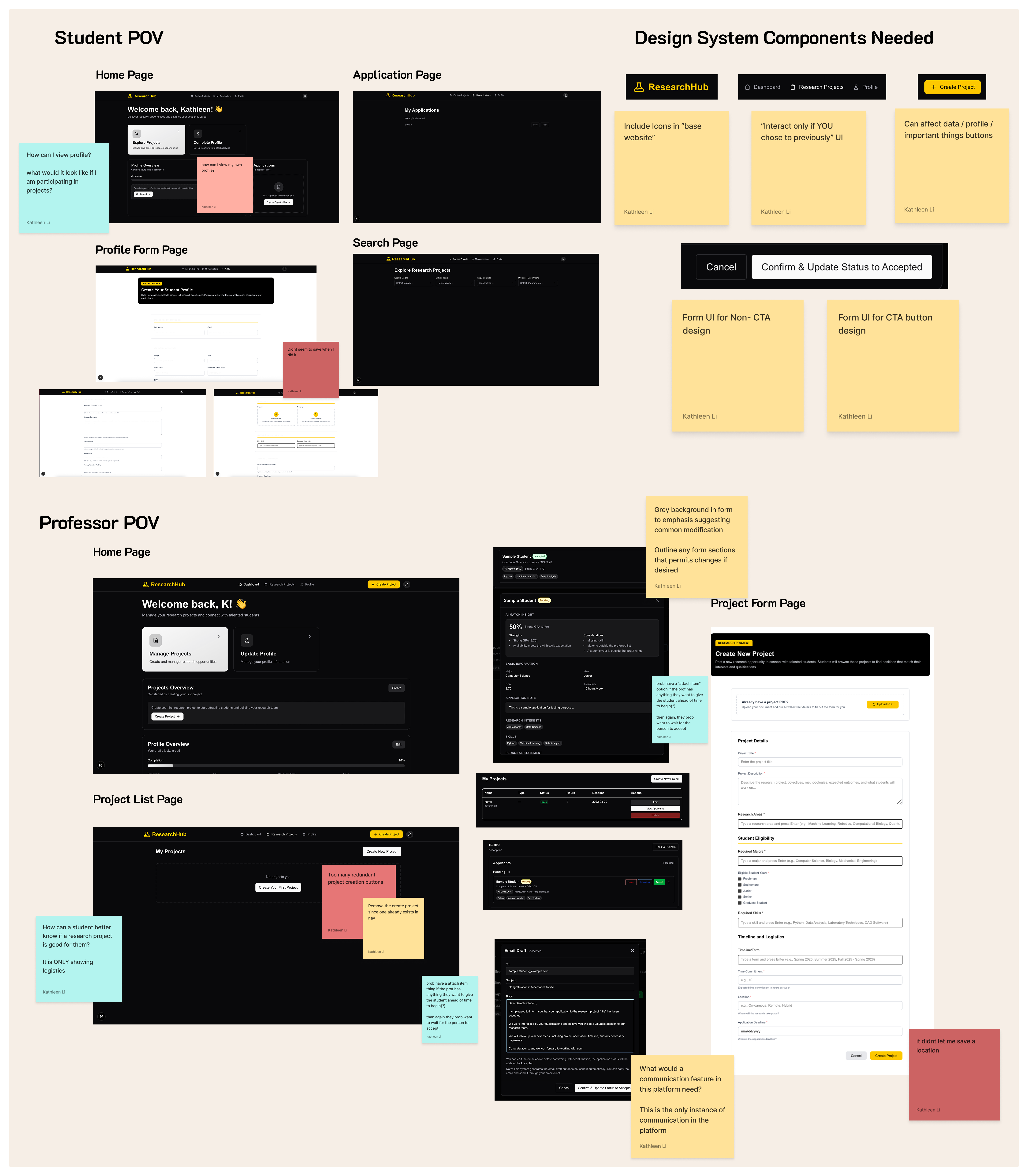
Redundancy and Technical Issues. Although the platform has a mostly functioning base, there are instances of elements with the same affordances being implemented on the same page, along with technical issues such as data modifications not being saved. I either noted these findings or reported them to the development team for quick resolution.
Hinted-at but Unfulfilled Features. The platform introduces the existence of various features such as profiles, project listings, and instances of communication. However, those features have not been fully utilized, leaving gaps that need to be addressed.
Design System Components Needed. While exploring the platform, I was able to interact with and track various elements such as buttons, cards, and navigation labels that needed to be accounted for when constructing the design system later on.
Understanding User Needs
Due to being informed of future meetings with our client, Professor Reese, that guaranteed insights for professor needs, I focused on personally reaching out to interview for student needs. Specifically, I conducted 4 student interviews and synthesized them through affinity diagramming.
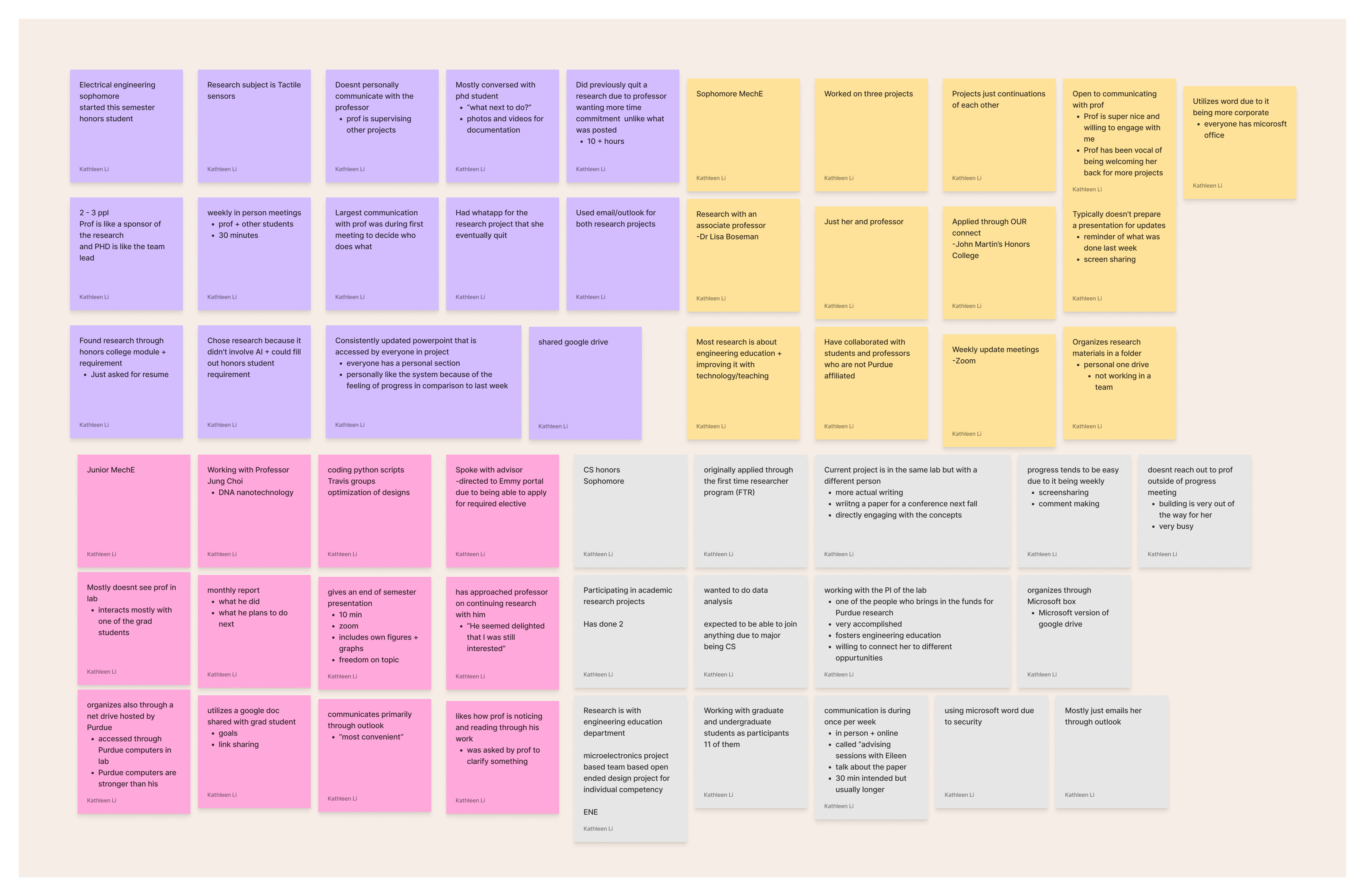
During the interviews, I learned about Purdue students’ current experiences with research projects by probing for the following information:
- Discovery of Research Project
- Process of Applying
- Progress Meeting Logistics
- Research Deliverables (If Applicable)
- Current State Views
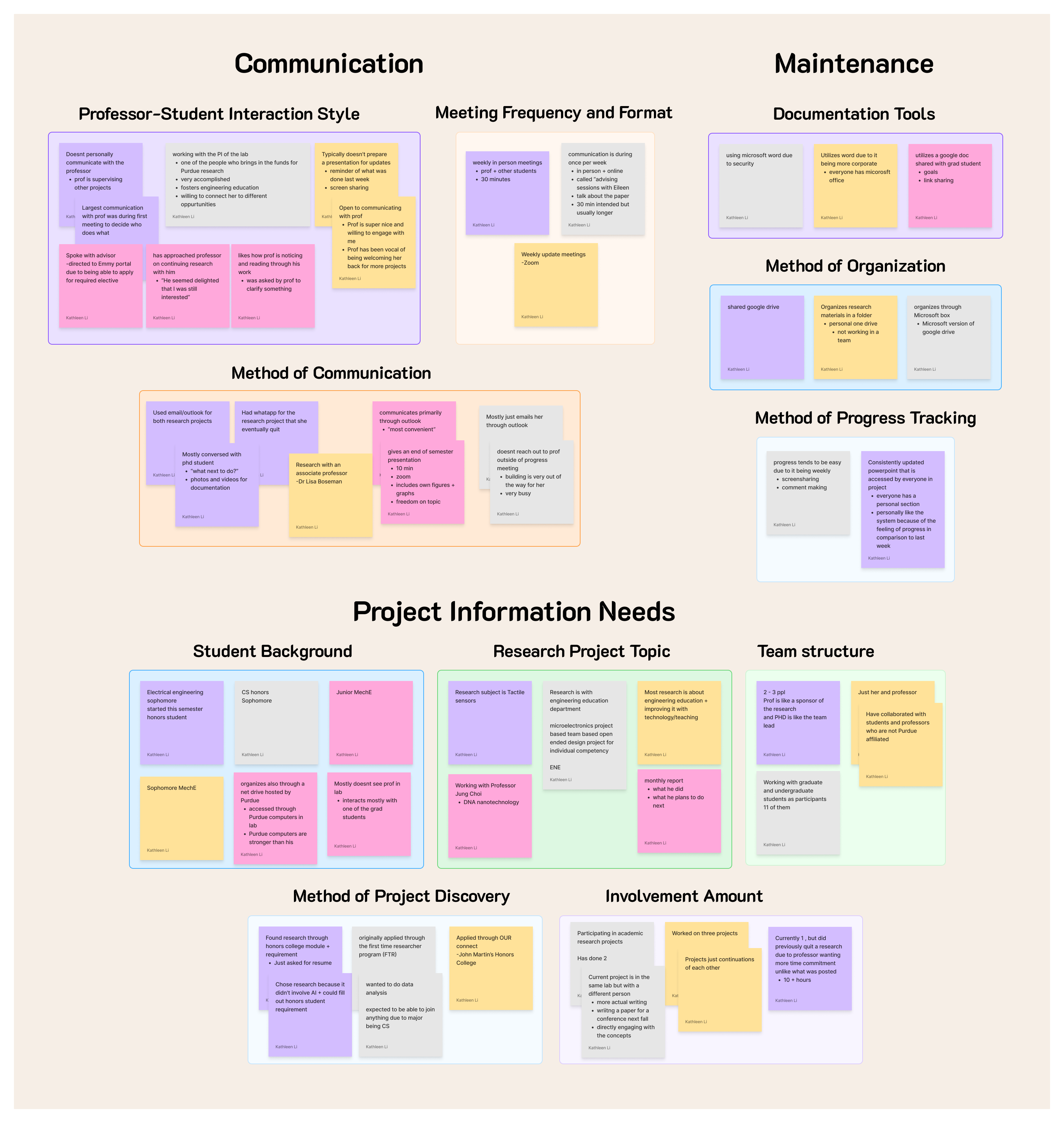
After finishing all the interviews, I then synthesized the findings through affinity diagramming, allowing me to cluster the findings into the following themes:
- Communication
- Maintenance
- Project Details
From the synthesized findings, I was able to recognize the main student needs that the new features needed to address, specifically regarding ease of communication with professors and project maintenance through file organization.
On the professor side, I was later informed that Professor Reese’s schedule had unexpectedly prevented the meeting for in-depth professor-side insights.
Within the sprint window, I decided to base the professor needs on the features Professor Reese had requested during an earlier meeting with my project lead. I then prioritized those requests by how frequently students would interact with each feature, so the highest-student-impact professor-requested features would ship first even under the tight timeline.
The Core Features Professor Reese Requested
From the earlier meeting notes, the core features Professor Reese requested for the professor side, in prioritization order (by how frequently students would interact with each), were:
- Individual project workspace to centralize tracking of details, team, progress, timeline, and optional milestones. Prioritized first, as this is the primary interface students would return to most often.
- AI review tests to verify that students had actually read the assigned research documents. Prioritized second, as students would encounter it on a per-document basis throughout the project.
- The ability to “finalize” projects, and to check whether the students on the project wanted referral letters at that point. Prioritized last, since the interaction only triggers at a project’s end.
Designing
From Existing Base to Handoff-Ready Prototypes
The design process ran through brainstorming to handing off three stages:
- Identifying UI patterns from familiar platforms
- Refining UI around Purdue identity
- Wireframing for development handoff
Referencing UI Patterns from Familiar Platforms
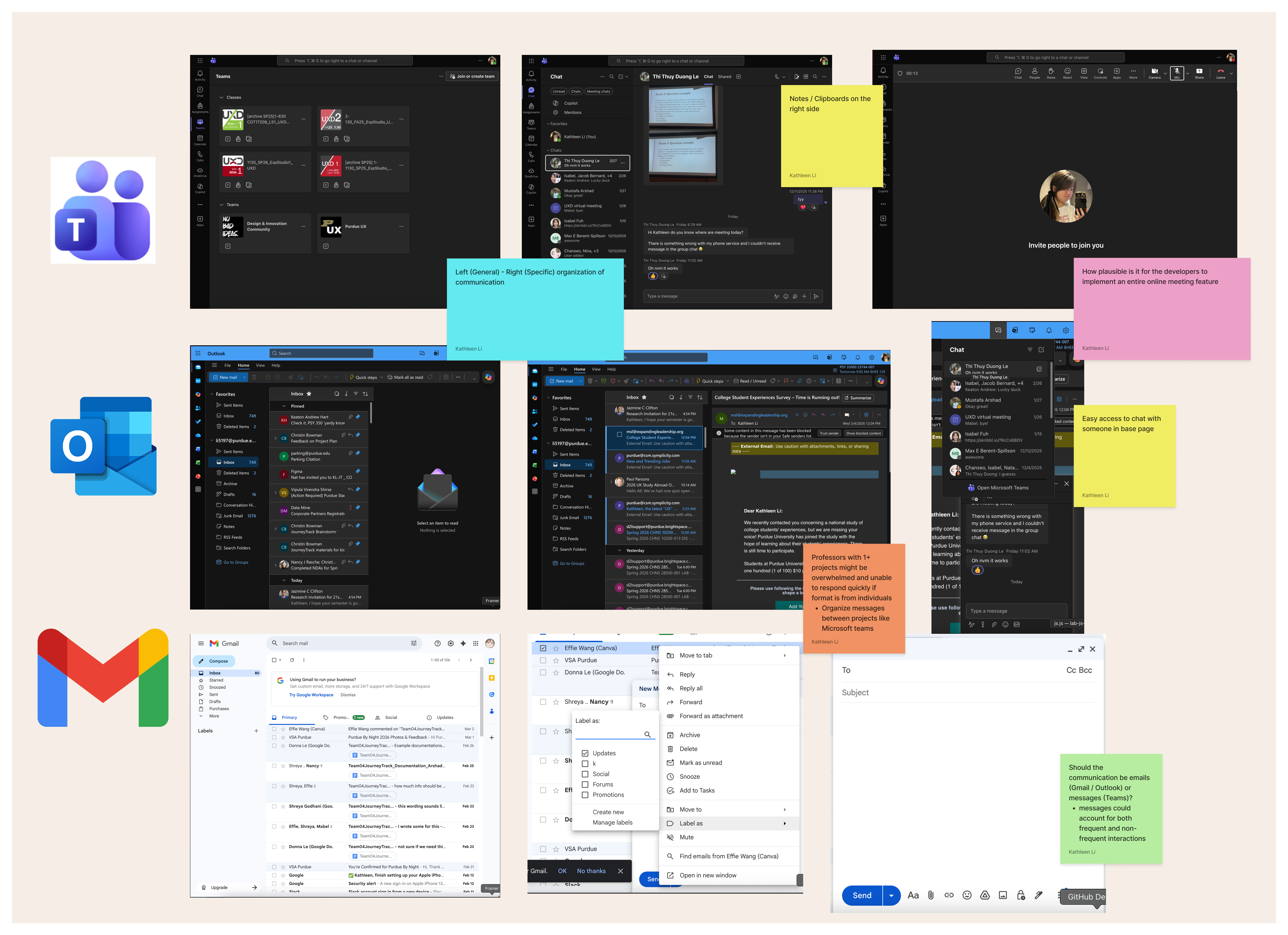
Due to students frequently mentioning platforms such as the Microsoft suite, Outlook, and Gmail as the tools they currently used to communicate with professors, I decided to reference the same platforms when designing the UI for ResearchHub.
As a result, interaction patterns from those platforms were utilized as the base design for the platform components with modifications to better fit the platform's focus on organization by project rather than by individual.
Refining UI Around Purdue Identity
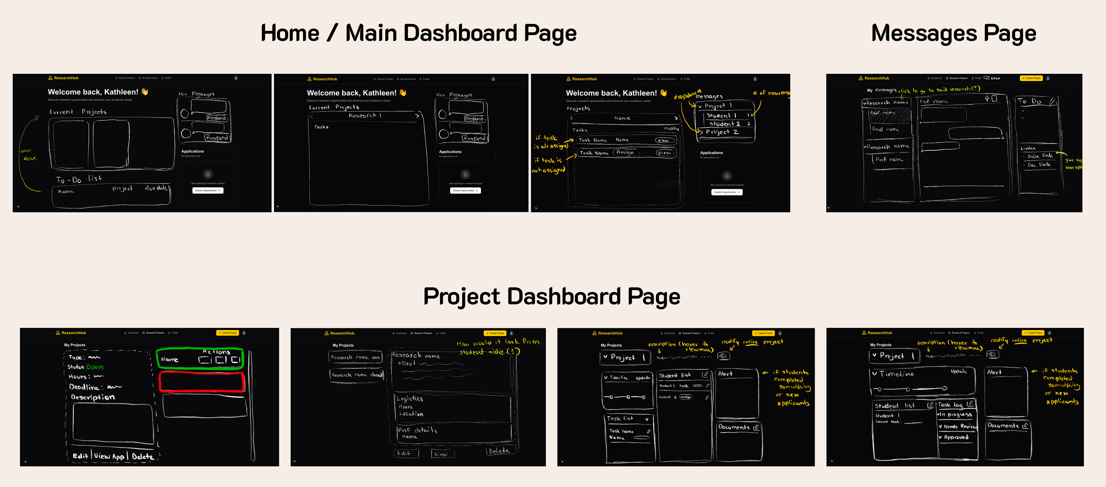
After identifying the reference platform UI patterns, I moved on to sketching ideas for the platform’s features and screens to explore possibilities quickly. During these sketching sessions, I showed the sketches to my teammates to discuss the plausibility of developing each page’s components, while also gathering outside feedback in parallel.
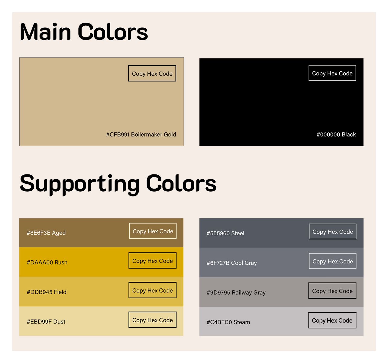
Since the platform being utilizable next semester was the project’s main priority, I deliberately kept the design system work minimal so the ship-critical features could take priority.
As a result, I focused instead on refining the existing UI and components to be more reminiscent of Purdue University through color scheme and text that would highlight the platform’s identity as primarily a Purdue research platform.
Prototyping for Developer Handoff
To keep development on schedule, I wireframed the platform in Figma while concurrently discussing implementation plausibility with my teammates and gathering outside feedback on the wireframes for both feasibility and usability.
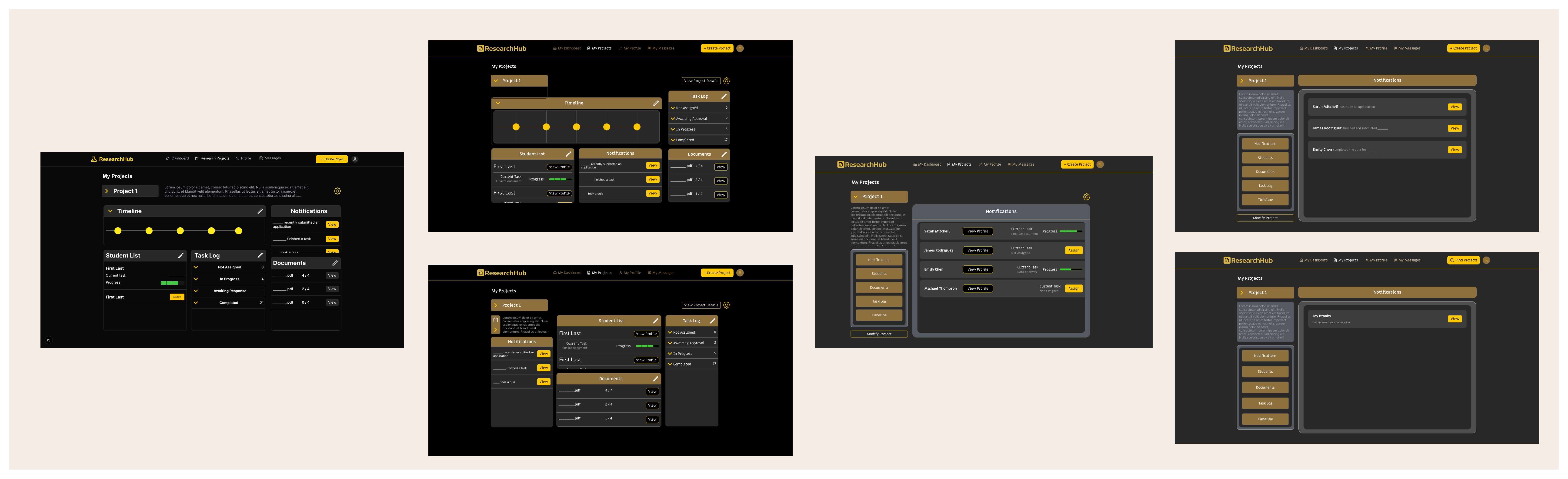
Since I needed to wireframe both the student and professor flows in that same window, I utilized Figma Make (AI-assisted design tooling) to keep pages shared by both accounts consistent in design without re-drawing the same components across two flows.
The final Figma prototype showcased the full redesign as connected flows that were applicable to real-world use cases of the platform that include the following:
- Students logging in to just update task progression
- Communication between students and professors
- Professors maintaining and organizing contents of each project
General Dashboard
The dashboard was designed to centralize everything a user might need on a monotonous day. For example, a student just need to update task progression or send messages while a professor might need to assess the progression of their students.
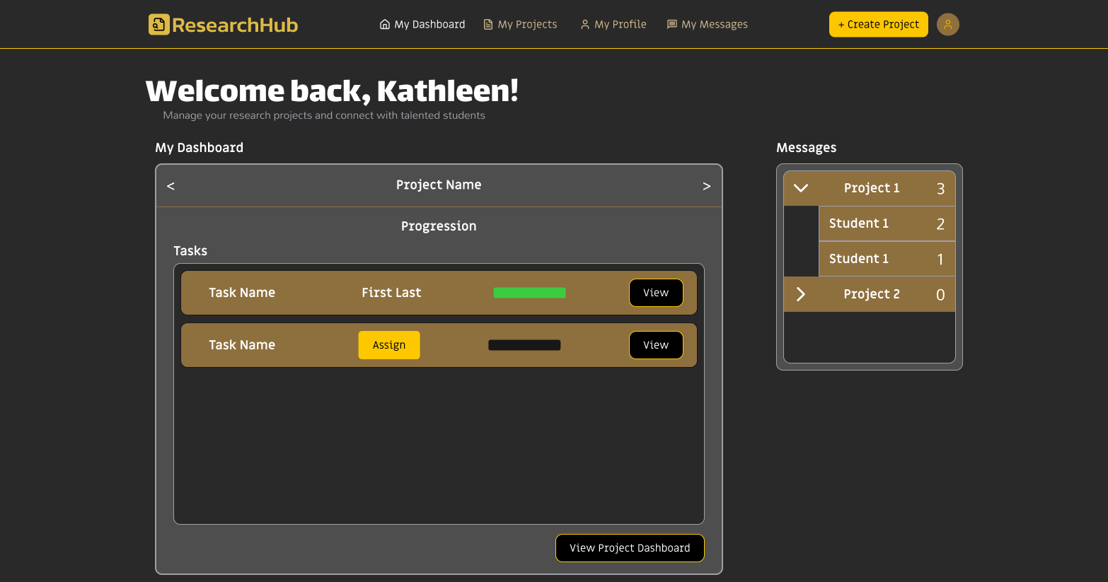
Key features:
- Mini Project Dashboard that provides access to tasks and to other projects
- Buttons to access specific project dashboards and direct messages within one click.
Communication
The messages page was designed to provide organization for communication between professors, research assistants, and students through organizing messages and content in a structure familiar to students and staff.
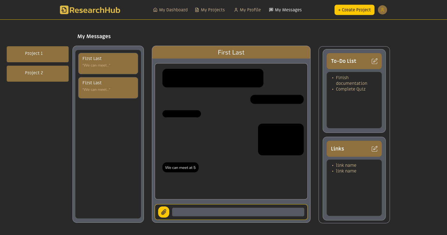
Key features:
- Standard file-attachment feature as the base affordance for familiarity to other platforms
- “Simplfied Kanban or pin board” to track progression and links to external resources or tools also spares the development team from additional integrations into the platform.
- Two-level navigation from projects down to individuals similar to Microsoft Teams' organization classes down to specific channels.
Project Content Maintenance
The project dashboard was designed to centralize a project's content without overwhelming the viewer though a left-side navigation to segment the page into five sections (Notifications, Students, Documents, Task Log, and Timeline). Its inception was from Professor Reese's request for a dashboard for project maintenance.
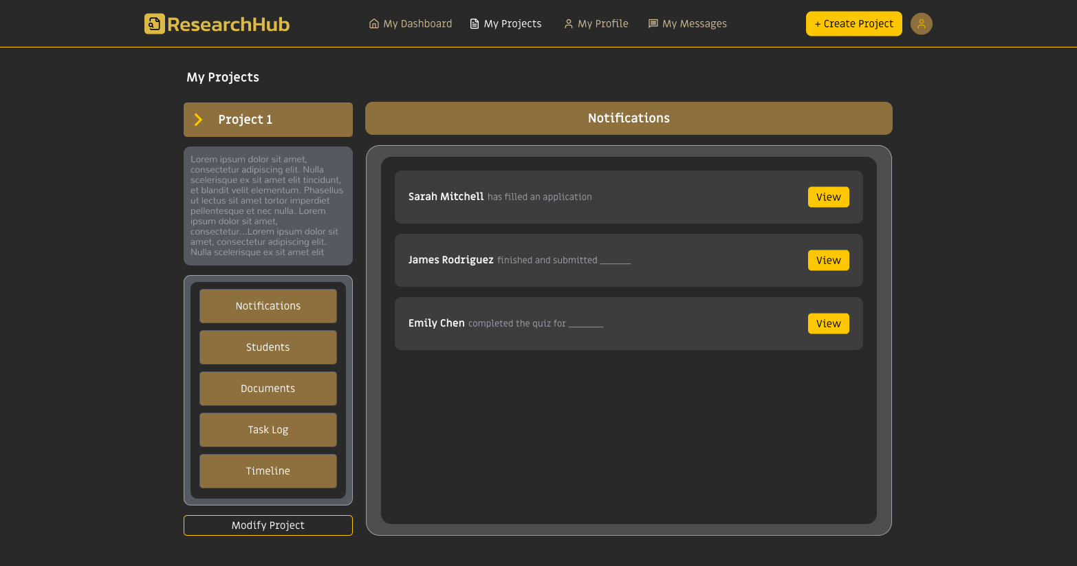
Key features:
- Left-side navigation splits content into five sections (Notifications, Students, Documents, Task Log, and Timeline) to avoid overwhelming the viewer.
- Each section serves both roles simultaneously, so professors manage the content while students engage with it in parallel.
- The Documents section includes AI-generated comprehension quizzes to verify students have read the assigned materials, addressing one of Professor Reese’s core-feature requests.
Implementing
Stepping In to Ship the Platform on Time
As the wireframe designs were finalized, I then began to also contribute through coding, specifically front-end React. My distribution of work was the more mundane yet tedious parts of code for my teammates who are more code-savy to focus on the more complex aspects of platform, ensuring efficent progression through optimizing our indivdual skills.
I also unexpectedly needed to expand upon my current designs when moving onto a new page as I needed to account for the reactivity of features formatting to be adaptivable to any browser size.
Takeaways
Design With the Cost of Building in Mind
Directly building my own ideas significantly modified how I factor in limitations. Sometimes I would code while thinking, half-annoyed, “Jeez, who is the designer who designed and requested all of these details”. Working as both designer and engineer emphasized the need to ideate as a development partner rather than an ideater.
From this project, I better understood that a design’s demands include the building cost, and that a designer who accounts for the cost is able to ensure a well-designed handoff would be fully utilized.
Adapting to Uneven User-Group Access
Due to needing conceptualization finalized in the project’s first weeks, I was unable to conduct user research on professors as in-depth as I did with students, since the two user groups offered very different levels of access. I had only one professor (our client) available and an entire campus of students readily available. As a result of the constrasting amount of specific user feedback, I prioritized the features Professor Reese had requested by how frequently students would interact with each, so the highest-student-impact professor-requested features would ship first.
From adapting to this obstacle, I now recognize that working with uneven user-group research requires sequencing the less-accessible group’s requests by how frequently the more-accessible group would interact with each, so I can prioritize the applicable ideas ahead of the impractical ones.